Consumption, investment, and savings
There is a lot of talk about the current shape of economic activity in New Zealand being “unsustainable” or “imbalanced”. In order to help think about these issues, this article will run through expenditure shares of GDP in New Zealand and how to interpret what these shares are telling us.
When looking at the macroeconomy it can be useful to look at shares of national account data. There are three types of shares: factor (or income) shares, production shares, and expenditure shares. Each type of share can be viewed in terms of nominal/current prices (where we are looking at the price of goods and services as they were at each point in time) or real/chain-linked prices (where we fix the price of goods and services to estimate the volume of activity).
All six of these possible decompositions can give us a useful insight to the structure of economic activity and can help us answer questions about what is changing, whether changes are sustainable, and whether these changes are a positive or negative outcome.
Here we are going to use both nominal and real expenditure factor shares to help provide some stylised facts regarding the spending of New Zealanders and what we get out of it – although at a very broad level.
The expenditure view of gross domestic product measures GDP with regards to the amount spent on final goods and services produced in New Zealand. This gives us the familiar equation: GDP = Consumption + Investment +Government Spending + Exports – Imports. Government spending is made up of both consumption and investment, so it is usually split and included in those two categories.
GDP is also a measure of income, although it does not capture financial transfers (such as interest payments on debt), income stemming from changes in the terms of trade, or much of the non-market activity that occurs (eg you mowing your neighbour’s lawn out of generosity). Accepting these shortcomings, we can then compare consumption to GDP in order to get an indication of how much current national income is spent on consumption and how this has changed over time.
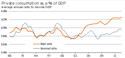
In Graph 5.4 we have the value and volume of private consumption as a percentage of GDP, while Graph 5.5 shows the value and volume of total consumption (private plus government) as a percentage of GDP.
On the private consumption side, there are a few interesting things to note:
- The actual nominal expenditure of households has stayed within a narrow range over the past 20 years. This result differs from a number of our trading partners, who have seen household spending from income rise.
- When we look at the amount of income spent by households, the 2002-2007 period does not look that out of the ordinary. Instead it looks like households were able to buy more consumer goods without increasing spending significantly.
- The value of household expenditure to income has risen over the past year and is at a relatively high level. This lift is part of the reason why we don’t anticipate exceptionally strong growth in consumer spending over the next three years.
Graph 5.4
Graph 5.5
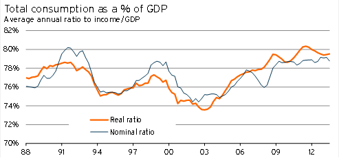
Once government consumption is also included the picture changes significantly. Although technological improvements and trade have helped to push down the relative price of private consumption, the price of government consumption has risen considerably during this period. Although this trend is unsurprising, given the types of goods and services that the government provides1, the magnitude of the shift due to government consumption is striking.
The initial upswing in government consumption occurred during the 2005-2007 period, adding to domestic demand pressures at time when the economy was already running hot. Anne-Marie Brook has discussed this period in her article Making fiscal policy more stabilising in the next upturn: challenges and policy options2. Strong government demand for resources effectively pushed up interest rates and the exchange rate over this period and, as the comparison of Graph 5.4 and Graph 5.5 shows, it was government consumption that made overall spending out of current income high during this period.
We also know that, for a nation, Income = GDP = Consumption + Savings. Using our equation from earlier, this tells us that Savings = Investment + Net Exports, so as a starting point we can see the ratios of investment and net exports as a form of savings.
What do the ratios suggest about these items?
Graph 5.6 illustrates how much private investment as a share of the economy slumped during the recession. Although recent data revisions have toned down the size of the decline, it was still significant. Even now, at 15.1%, spending on private investment as a percentage of GDP remains below its 20-year average of 16.3%.
Graph 5.6
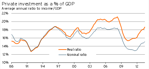
However, the volume of private investment is once again fairly high, sitting at 18.7% of real GDP. Part of the reason for this difference is the significant “quality improvement” and price declines in many forms of private investment, which have been caused by:
- soft growth in imported capital good prices due to the high exchange rate and productivity improvements overseas.
- quality improvements in plant and machinery equipment (eg increases in the speed of computers).
Although it is agreed that there have been real quality improvements in plant and machinery equipment, the magnitude of the improvement is up for debate (eg whether the increases in computer processing speed can be fully counted as an increase in GDP). As a result, the volume of private investment (and the upward trend in its share of real GDP) may well be overstated.
During the 2002-2007 period, spending on private investment and the volume of private investment relative to income was very high. Significant expenditure on residential property was behind this lift, as households used property investment and construction as a form of savings. When discussing KiwiSaver and private savings, John Gibson and Trinh Le mentioned3 New Zealanders’ investment in property. Ultimately, if the level of private investment in residential property was “too high” during that period, savings by households may not be too low, but instead may have been misallocated by households being too exposed to the property industry4.
Graph 5.7
Graph 5.8
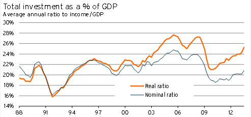
Including government investment, current national expenditure out of income on investment (21%) appears to be only slightly lower than its 20-year average (21.6%). However, with the Canterbury rebuild underway there is significant scope for investment as a share of GDP to pick up further.
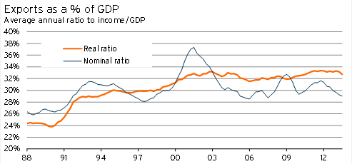
Looking at net exports, New Zealand tends to run a small surplus on the balance of trade in goods and services. In other words, nominal exports tend to exceed nominal imports5.
If we look at the total volume of trade, there are a few interesting features:
- Since New Zealand opened up its economy during the 1980s, both exports and imports as a share of economic activity have increased considerably. The value of trade relative to domestic income rose from 48.3% in September 1988 to 57.7% in September 2013.
- The volume of both exports and imports as a percentage of real income rose more strongly than the value of exports and imports as a percentage of nominal income. In other words, the volume of goods and services from trade relative to domestic production rose more strongly following liberalisation than the amount spent on and received in trade.
- Although our trade balance relative to income changed little over this period, the volume of imports we received grew significantly more than the volume of exports we sent out of the country. This reflects the positive effect of the increase in export prices and New Zealand’s terms of trade. We can purchase more things from overseas without having to sell more of our own goods and services.
Graph 5.9
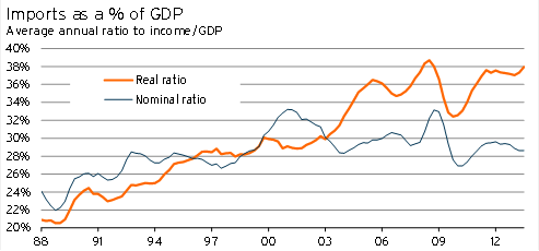
With regards to the first two points, the higher trade values and volumes are partially down to the lift in export prices that New Zealand has experienced in the past decade, and the corresponding lift in the terms of trade. However, this trend of rising trade exposure was taking place prior to the lift in New Zealand’s terms of trade.
As we have mentioned previously, the strong lift in manufacturing productivity in China and much of the rest of Asia really kicked off in the early 1990s – at a time when the New Zealand economy was experiencing rising oil prices and weak export prices. With companies such as The Warehouse getting on top of parallel importing early, the offshore productivity improvements may have had some impact.
However, it is more likely that the initial change in trade values stemmed from the trade liberalisation and increasing labour market flexibility that New Zealand experienced during this period. Faced with a much more global marketplace, New Zealand firms had to change what they produced and who they treated as their consumer. This view also helps to explain why the effect was relatively larger on the import side than the export side.
One factor that will only be partially captured by these figures was the increase in the variety of products available post liberalisation. If the value of choice and variety could be incorporated in GDP statistics, the adjustment would have been even starker.
The implied savings we’ve discussed here is different from typical measures of savings. When it comes to thinking about broader issues of savings in New Zealand, Treasury has been considering these issues in recent years6.
We have covered the trends in a lot of expenditure GDP ratios here, and uncovered a few stylised facts about the New Zealand economy over the past 25 years.
- Private spending on consumer goods has not been out of the ordinary, but the volume of consumer goods that households have received has been high given the outlay they made.
- Spending on private consumption, out of current income, has recently pushed to a relatively high level, indicating that there may be some constraints to future growth.
- Total consumption has been high, as government spending has risen sharply.
- Private and public investment had been elevated prior to the Global Financial Crisis.
- Private investment dropped sharply during the recession and is now nearing normal levels.
- Private investment in residential property, out of income, was high between 2002 and 2007.
- The volume and value of export and import activity has risen sharply since the late 1980s.
- ·New Zealand tends to run a surplus on its balance of trade.
- Both investment and trade volumes may be being overstated by the way that Statistics NZ deals with “quality changes” in goods and services (eg computers).
Overall, the expenditure GDP data gives a clear indication of the way the rising terms of trade, and growing globalisation, have influenced outcomes in the New Zealand economy. On the face of it, none of the data indicates that the economy is on an unsustainable footing.
1 A neat video discussing the effect can be found at
http://mruniversity.com/courses/development-economics/bela-balassa
2 www.treasury.govt.nz/downloads/pdfs/mi-brook-paper.pdf
3 http://ideas.repec.org/p/wai/econwp/08-03.html
4 The ideas that New Zealanders may have invested too much in property, but that there is a shortage of housing, are not necessarily contradictory. New Zealanders may have been building the wrong type of housing (houses that are too large), overpaying to build property, or simply have built in the wrong places.
5 New Zealand tends to run persistent current account deficits, even though we have persistent surpluses in our net exports of goods and services. This result is because of New Zealand’s net liability position, and the resulting net outflow of debt servicing and dividends payments – an investment payments deficit.
6 Work can be found at www.treasury.govt.nz/publications/research-policy/tp/saving and www.treasury.govt.nz/publications/research-policy/wp/2013/13-04/.