Usually in our monthly newsletter we feature a single “chart of the month”, but this time we are featuring April as the “month of the chart” and making a chart for each day. Cédric Scherer and Dominic Royé have organised the #30DayChartChallenge on Twitter, inspired by the success of the similar #30DayMapChallenge, as a chance for aspiring and experienced data visualisation enthusiasts to practise, try new tools and techniques, and to share ideas. They provided 30 topics that allow a range of interpretation, which have been enthusiastically taken up by over 130 people and organisations around the world.
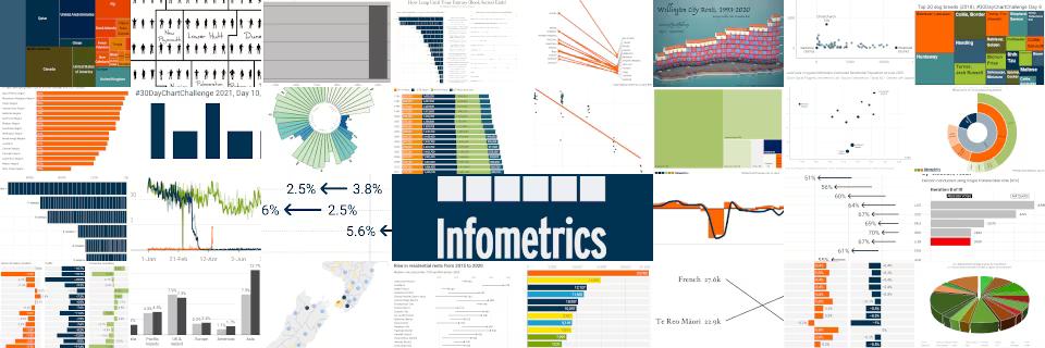
The team at Infometrics thought this would be a good opportunity to try some new things and highlight some interesting New Zealand economic (and economic-adjacent) data. It wasn’t well-timed for us, with quite a lot of work on this month, but even though we didn’t manage the pace of one chart per day we did manage to produce 30 between five of us – Andrew Beattie, Brad Olsen, David Friggens, Nick Brunsdon and Paul Barkle. We mostly used Datawrapper and the R programming language, but produced a couple with Excel, Powerpoint and even the game Townscaper.
Enjoy our offerings below, and be inspired and educated by the wealth of creativity on display from other challenge participants.