This month I’ve been participating in the #30DayMapChallenge – an informal event organised online for geospatial and cartographic enthusiasts to learn, practice and “have fun”. There are 30 daily prompts to inspire, and anyone who wants to can just post to their preferred social media platform (eg Twitter, Instagram, …) with the hashtag. It’s a great opportunity to get creative and try new things, without the pressure to fully polish the outputs before sharing.
I managed to reach the full 30/30 this year, which is much more than I expected given everything else going on. I’m a relative novice, and they always take longer than I expect, but I’ve learned a great deal over the month.
The maps are grouped here in themes – Trade and Business (5), Population (5), Boundaries (4), Streets (5), Geography (10), and Meta (1). My favourite map – made with pizza! – is near the end.
Trade and Business
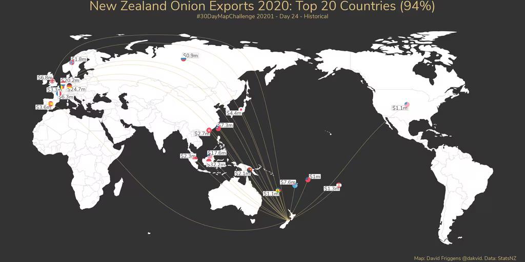
Historical (Day 24) – Onion exports
Last year’s onion export destinations seemed historical to me as my colleagues have recently written a report for OnionsNZ on future export opportunities using Export Market Finder.
Data: Stats NZ
Tool: R
Learning: This was my first time trying out a package for flag icons, and I learned an easier way to make “great circle” lines (those curved lines are actually straight lines on a globe).
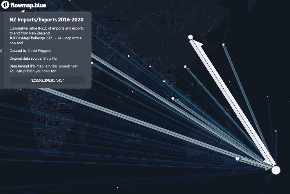
Map with a new tool (Day 14) – NZ imports and exports
I’ll be upfront that this is a terrible map! I discovered the flowmap.blue tool from other challenge participants and threw in total import and export values for all countries. It’s a little interesting to look at, but far too busy – if I was trying to make a “proper” visualisation I would at least pare back the countries included. The tool is also of limited value for a New Zealand focus as there appears to be no way to connect New Zealand to the Americas across the Pacific – having all the lines go west makes it messier. Interactive version
Data: Stats NZ
Tool: flowmap.blue
Learning: Consider a different type of data before trying this tool again. (My first thought was Census commuting data, but somebody has already done that.)
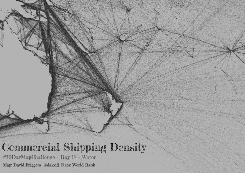
Water (Day 18) – Commercial shipping
This shows the density of commercial shipping in New Zealand waters and beyond. I had no idea what the shipping lanes would look like, so it was interesting to see them laid out. I struggled a lot with this one. I learned much more about working with raster data, but not enough to implement my initial plan. As frustrating as that was I was pleased with how this came out in the end.
Data: World Bank
Tool: QGIS
Learning: Some technicalities of raster data, and that there is more that I need to learn!
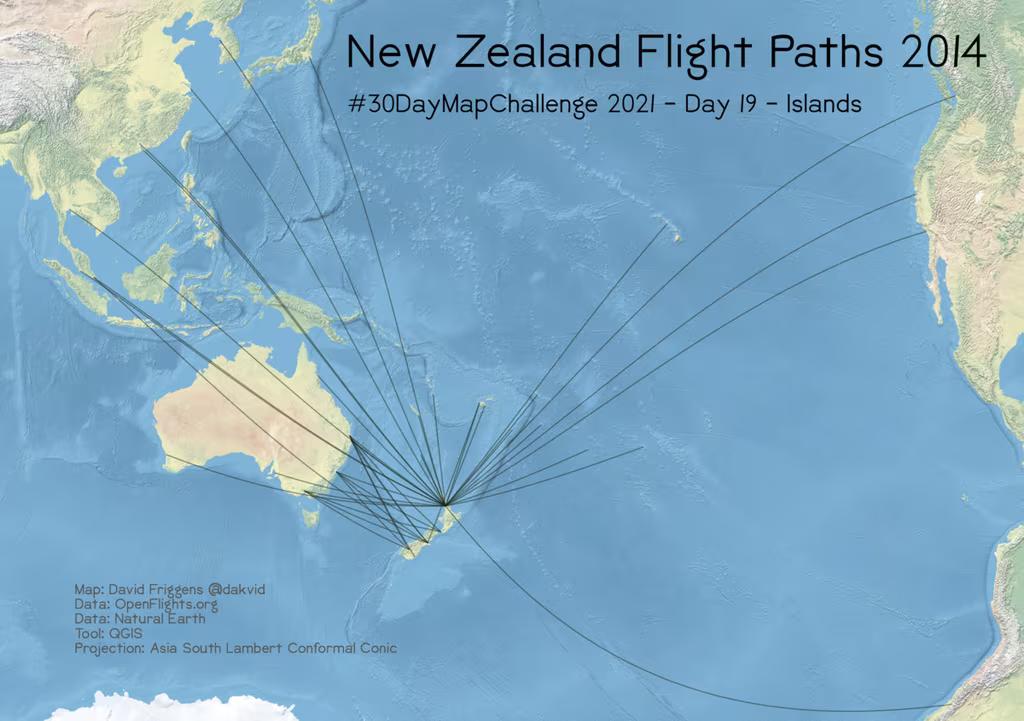
Islands (Day 19) – New Zealand flight routes
Being an island nation means we have to fly to anywhere else. 2014 was the latest data on flight paths I stumbled across, but it’s probably more interesting to look at than the current situation. I also chose a projection that accentuated the ocean space.
Data: OpenFlights.org
Tool: QGIS
Learning: I wanted to use the Spilhaus projection and learned some more about it, and unfortunately that it doesn’t seem (easily?) possibly with the tools I’m using. But I ended up learning more about a range of projections, including this Asia South Lambert Conformal Conic.
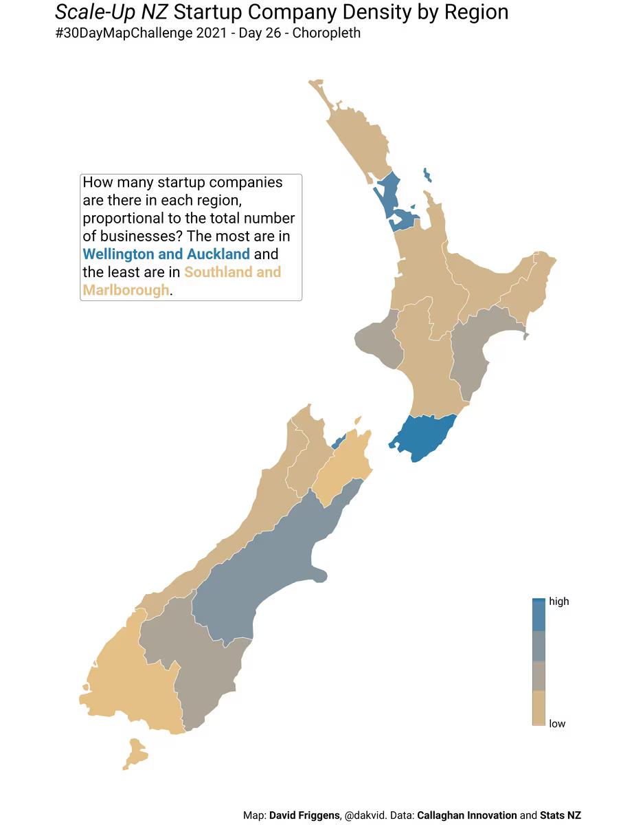
Choropleth map (Day 26) – Startup companies
I came across the Scale-Up NZ site on Twitter and was interested to explore their data on startups. Obviously Auckland has the most – it makes more sense to compare numbers normalised by the total number of businesses in each region.
Data: Scale-Up NZ / Stats NZ
Tool: R
Learning: Browsing the companies on the website was an interesting insight into some of the innovation happening around the country.
Population
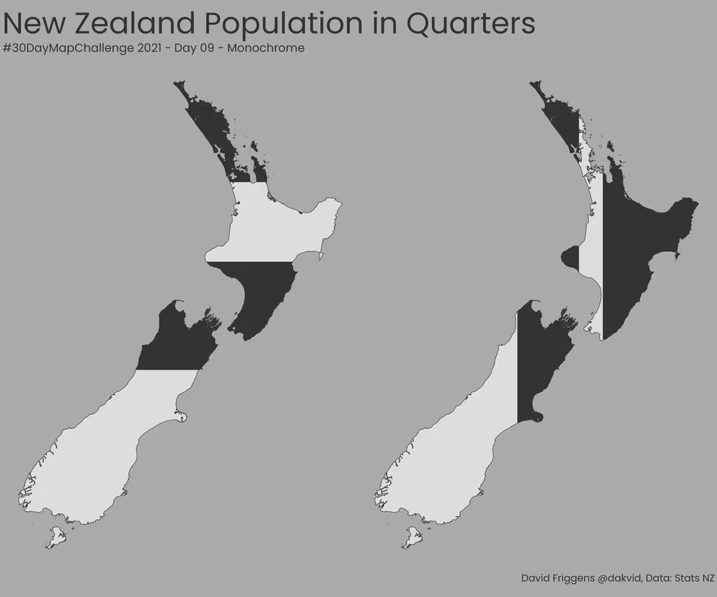
Monochrome (Day 09) – New Zealand quarters
A look at how the population is distributed, horizontally and vertically – inspired by similar maps of other countries in the challenge.
Data: Stats NZ
Tool: R
Learning: “Split this shape along this line” was not the intuitive easy step I thought it would be, but picking up the skills to do that helped quite a lot with some later maps.
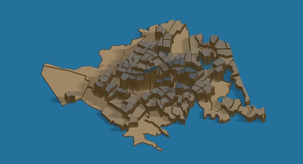
3D (Day 11) – Christchurch population density
I’ve been meaning to try out rayshader for some time, and it’s got a nifty function to easily turn charts (including choropleth maps) into 3d visualisations. This is the population of urban Christchurch by Statistical Area 2, with heights relative to the area size. The colour palette is based on the kōtare (kingfisher) from Manu.
Data: Stats NZ
Tool: R/rayshader
Learning: It was definitely easier than I would have thought, but not entirely straightforward. Knowing how to do it now, I’ll definitely use it more in future.
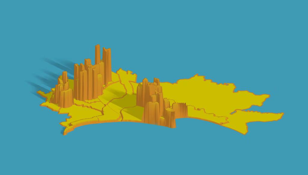
Population (Day 12) – Napier-Hastings population density
As as easy catch up late in the month I adapted the Christchurch code to look at Napier City and Hastings District (without the wider rural areas). As a former resident it was interesting to compare the density of Havelock North, Hastings, Flaxmere and Napier. I tried out some palettes based on Wes Anderson films – this one was Fantastic Mr Fox.
Data: Stats NZ
Tool: R/rayshader
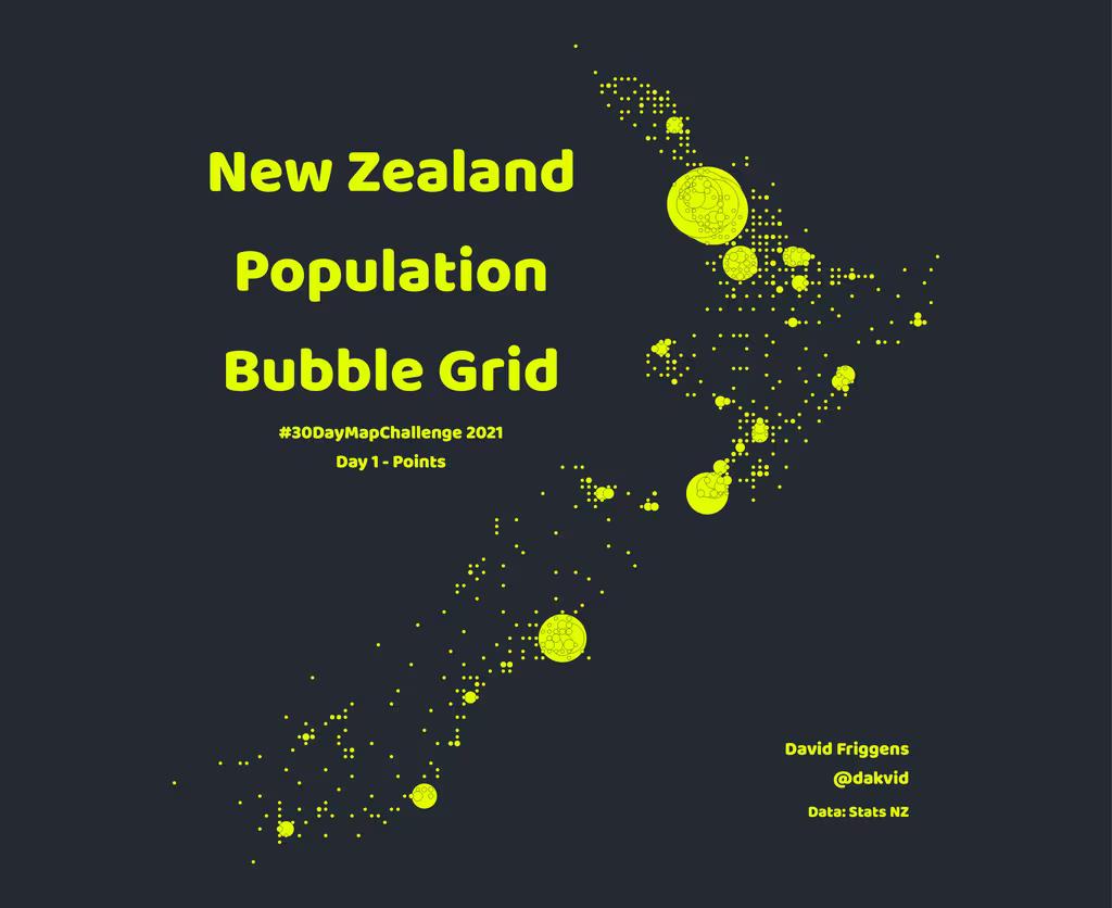
Points (Day 01) – Population grid
I was inspired to try an idea of a bubble grid from other mapmakers in the challenge, but this one was a bit of a dud for me. New Zealand is a bit small to make this work well – it effectively shows cities, but not in a particularly informative way. The original for Europe, with a larger grid, was much more effective.
Data: Stats NZ
Tool: QGIS
Learning: As my first effort, I was especially frustrated that I couldn’t easily translate my ideas into R code and ended up turning to QGIS. But after a month of learning I could do this relatively quickly in R now.
GHSL (Day 23) – Built up area density
The Global Human Settlement Layer looks like a fantastic resource, with a number of interesting datasets. Unfortunately, I wasn’t able to spend time exploring it during the month. To knock off this data-themed challenge (the final one I completed) I simply took advantage of the kindness of others and adapted David Schoch’s code to make a 3d map of built up area density at 1km resolution. I don’t know how accurate this data is, but it paints a familiar picture.
Data: GHSL
Tool: R / rayshader
Learning: The very basics of what GHSL has to offer.
Boundaries
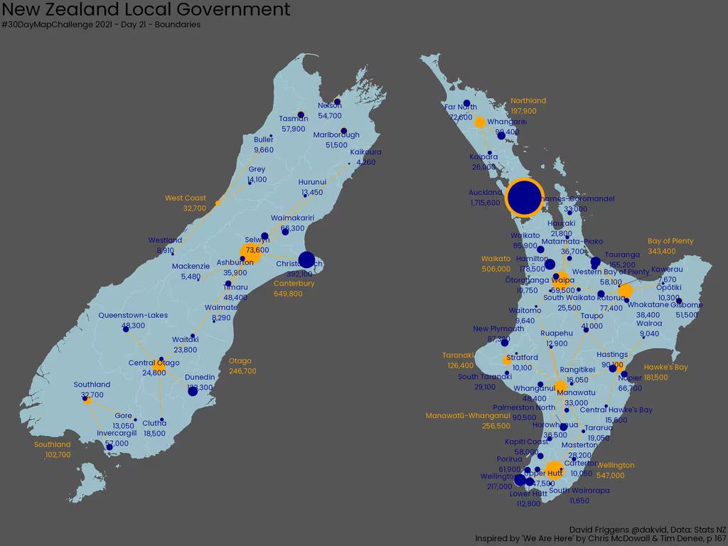
Interactive (Day 25) – Administrative area intersections
New Zealand has 16 regions, 65 territorial authorities (excluding Chatham Islands), 130 local and community boards, 226 wards, 21 district health boards, 65 general electorates and 7 Māori electorates. And together they create 446 intersections! This interactive map allows you to explore the different areas and their intersections.
Data: Stats NZ
Tool: R / leaflet.js
Learning: This is one technique I’ve used several times before, but getting the layout control working correctly required some googling.
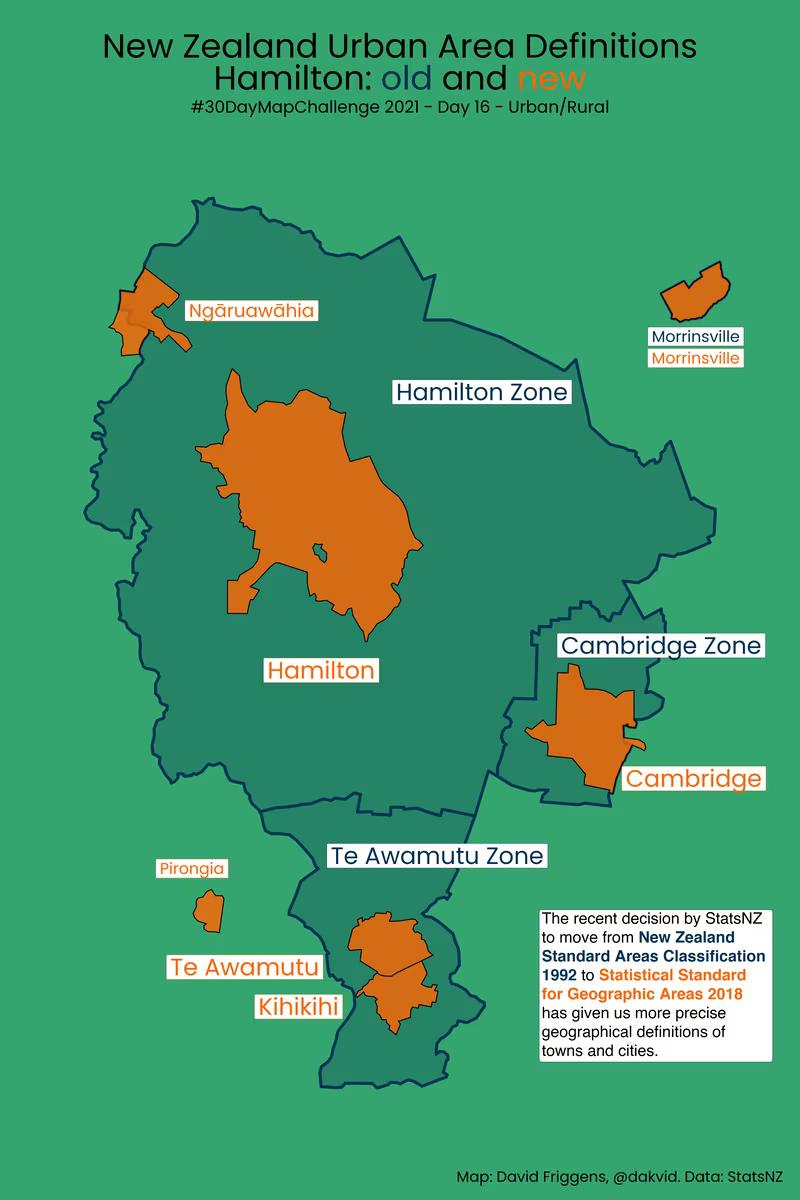
Urban/Rural (Day 16) – Urban definition changes
I’ve personally been quite pleased with the new urban area definitions in Statistical Standard for Geographic Areas 2018, which replaced the broader definitions in New Zealand Areas Classification 1992, but I haven’t tried to compare them cartographically before. I did plan to compare all the main urban areas, but time was tight so I stuck with Hamilton and will make some time to come back to the others in future.
Data: Stats NZ
Tool: R
Learning: Getting more experienced with the {ggtext} package to do more with colours etc than {ggplot2} allows out of the box.
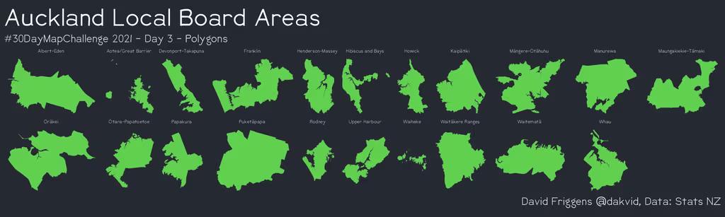
Polygons (Day 03) – Auckland local boards
The theme was polygons, so I laid out the shapes of Auckland’s local boards, in alphabetical order. We – especially non-Aucklanders – don’t often get to see the individual shapes by themselves.
Data: Stats NZ
Tool: R
Learning: Mostly, being the third map of the month, this was about shaking the cobwebs off and relearning things I hadn’t put into practice for awhile. And learning (as I would throughout the month) that just because something is a simple idea in my head doesn’t mean it will be simple to implement.
Boundaries (Day 22) – Local council relations
I was inspired to replicate a map from one of my favourite books – We Are Here: An Atlas of Aotearoa by Chris McDowell and Tim Denee (pp166-167). The idea is to show the regional and city/district councils, and their non-hierarchical relationships. Whilst the map is technically “complete”, it’s also messy and half-finished as I ran out of time. Working out pleasing label placement alone would require a lot of manual fiddling.
Data: Stats NZ
Tool: R
Learning: It takes an awful lot of work to make something that looks simple and beautiful! It made me appreciate even more what an amazing book We Are Here is.
Streets
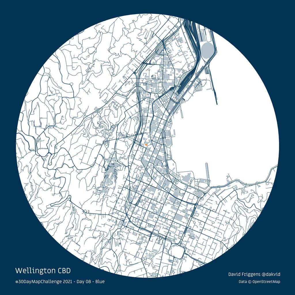
Blue (Day 08) – Wellington CBD
City street grids were quite popular in the challenge. Having been stuck working from home for most of the last few months I made one of Wellington CBD in Infometrics blue. If you look closely, you can see the office highlighted in orange.
Data: OpenStreetMap
Tool: R
Learning: Extracting different features from OpenStreetMap – the Wikipedia of maps. It’s amazing how much is available from there, and how easily.
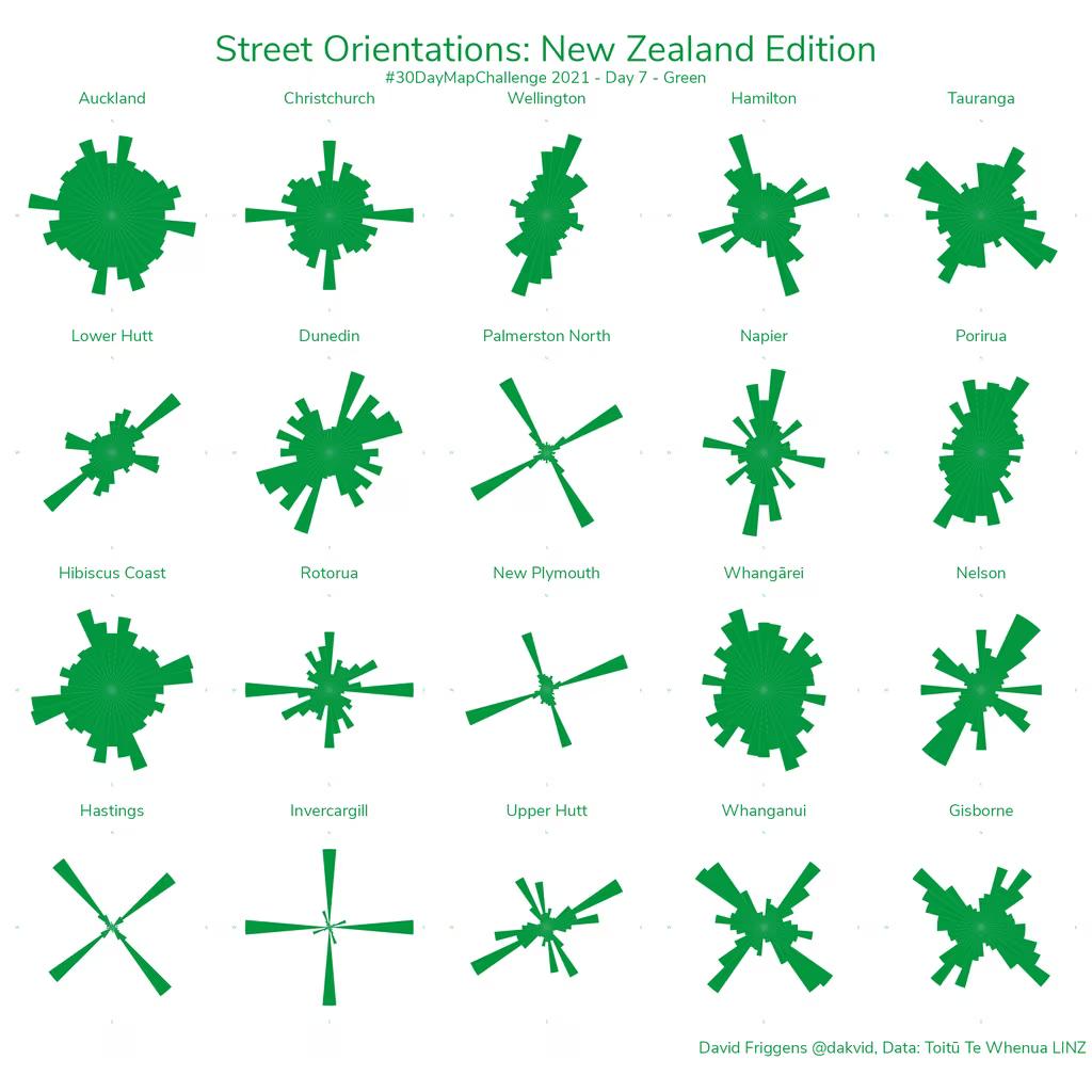
Green (Day 07) – Street orientations
I had seen some work a few years ago on the orientations of streets in US and world cities, and had wanted to try it out in New Zealand. Finally I had the opportunity! I had wondered if there would be any patterns as we don’t tend to have the rigid grids of many US cities, but there are some clear differences.
Data: LINZ
Tool: R
Learning: The exact shade of green on road signs.
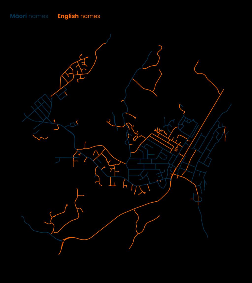
Lines (Day 02) – Māori/English street names
This is one of my favourite maps. Partly because it was my first time extracting data from OpenStreetMap and I was amazed at how easy it was. And because the classification of street name language was surprisingly insightful – the Māori names tend to be both in the earlier areas of settlement, and very recent subdivisions. So there’s a bit of local history encoded just in the street signs.
Data: OpenStreetMap
Tool: R
Learning: The world of OpenStreetMap.
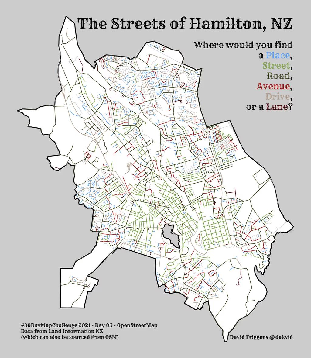
OpenStreetMap (Day 05) – Hamilton street types
I toyed with this approach earlier in the month but didn’t commit, however it was an easy one to come back to at the end of the month and quickly finish off. The obvious complaint is that I got the streets directly from LINZ, not from OpenStreetMap – but most of the local street data in OSM comes from there anyway because of the open licence. And I’ve used OSM for other maps.
Data: LINZ
Tool: R
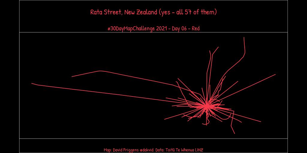
Red (Day 06) – Rata Streets
I had the thought that starting every Rata Street from the same point might result in something that looked like a rātā flower. And it kind of does, though a few are a little long.
Data: LINZ
Tool: R
Learning: Manipulating line positions – not as straightforward as I’d expected, but satisfying to figure out.
Geography
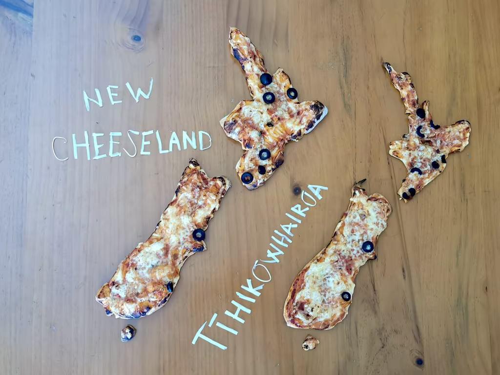
Made without a computer (Day 15) – New Cheeseland / Tīhikōwhairoa
When I noticed one evening that my homemade pizza base looked a little cartographic, I knew I had to try the “land of the long yellow cheese” for Day 15. I made two, as the first was a little too thick. I also chose city markers that were perhaps a little too large. But I was very pleased with the coastal accuracy of the second one, and they both tasted delicious!
Learning: Pizza dough is a very tricky medium for precise design. Next time I might choose Kansas!
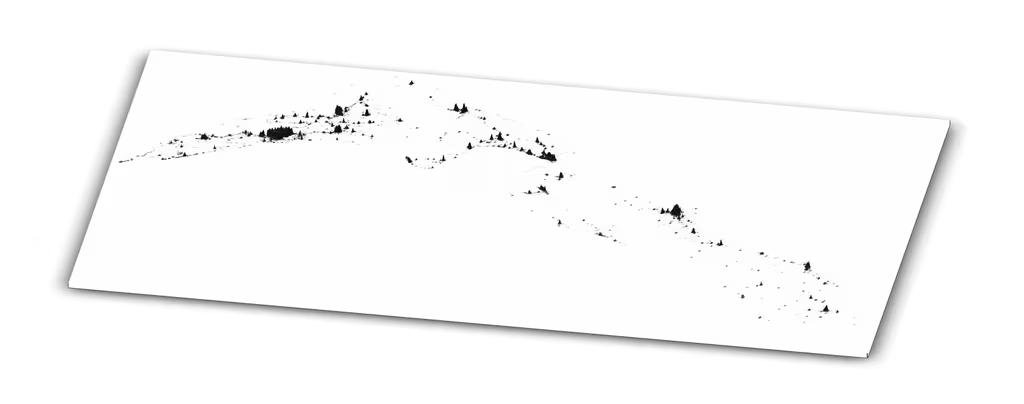
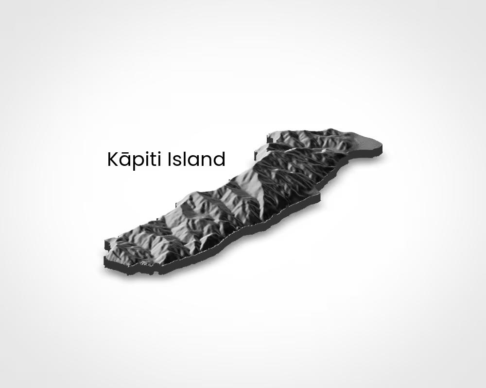
Raster (Day 10) – Kapiti Island
Rayshader makes it very easy to make beautiful 3d elevation models – I was able to make this following a tutorial and only half understanding what was going on. I will definitely spend some time in future to learn how to use it better.
Data: Stats NZ / Mapzen
Tool: R / rayshader
Learning: The basics of rayshader.
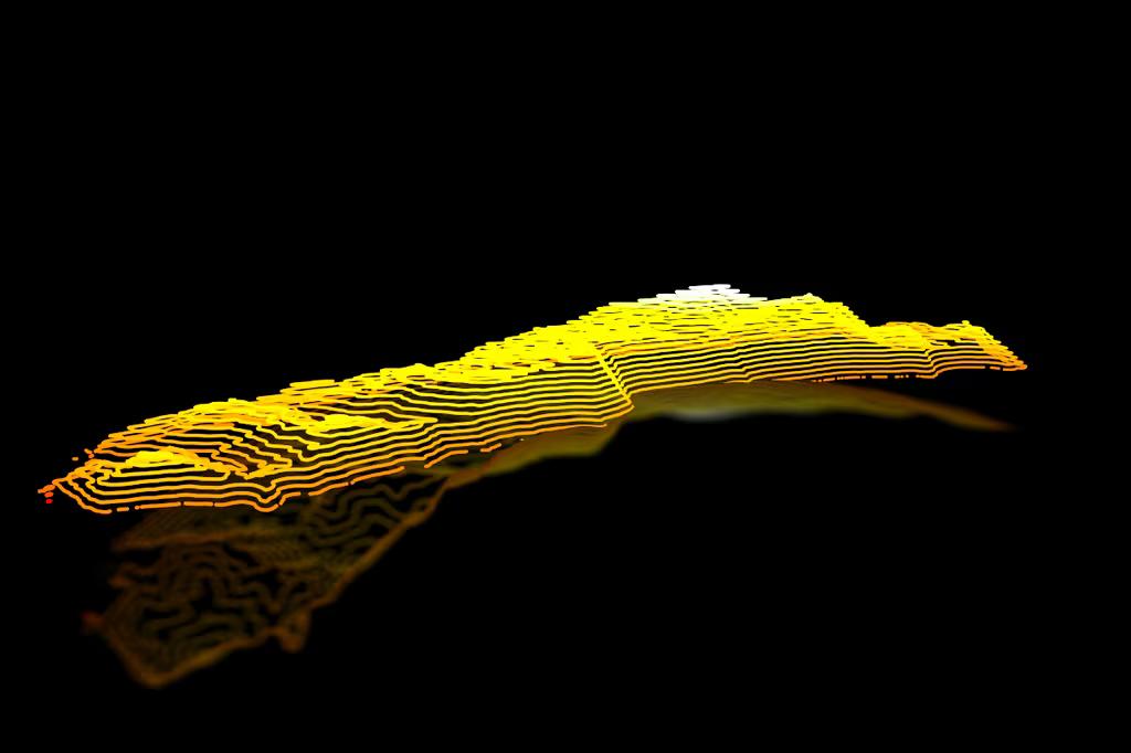
Elevation (Day 21) – Kapiti Island
During the challenge I came across a tutorial on making 3d neon contour lines with rayrender and really wanted to give it a go. It took a bit of effort to understand, but I was eventually able to make it work. I’m quite pleased with how it came out – click through to the tweet to see the video of it rotating!
Data: Stats NZ / Mapzen
Tool: R / rayrender
Learning: A lot about perspectives, but I’ve barely scratched the surface of what’s possible here. Rewriting the code from the tutorial in a style more familiar to me was very helpful for understanding what was going on.
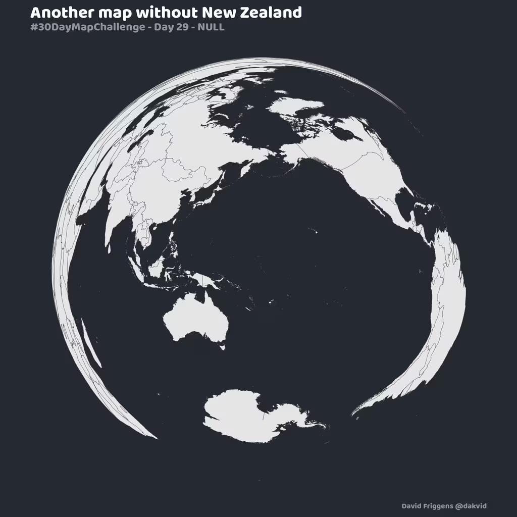
NULL (Day 29) – #MapsWithoutNewZealand
There’s a hashtag for spotting maps in the wild where New Zealand is missing – usually by dropping us off the edge. So I thought I’d do it “properly” by having a map centred on where New Zealand would be.
Data: Natural Earth
Tool: R
Learning: The Lambert azimuthal equal-area projection
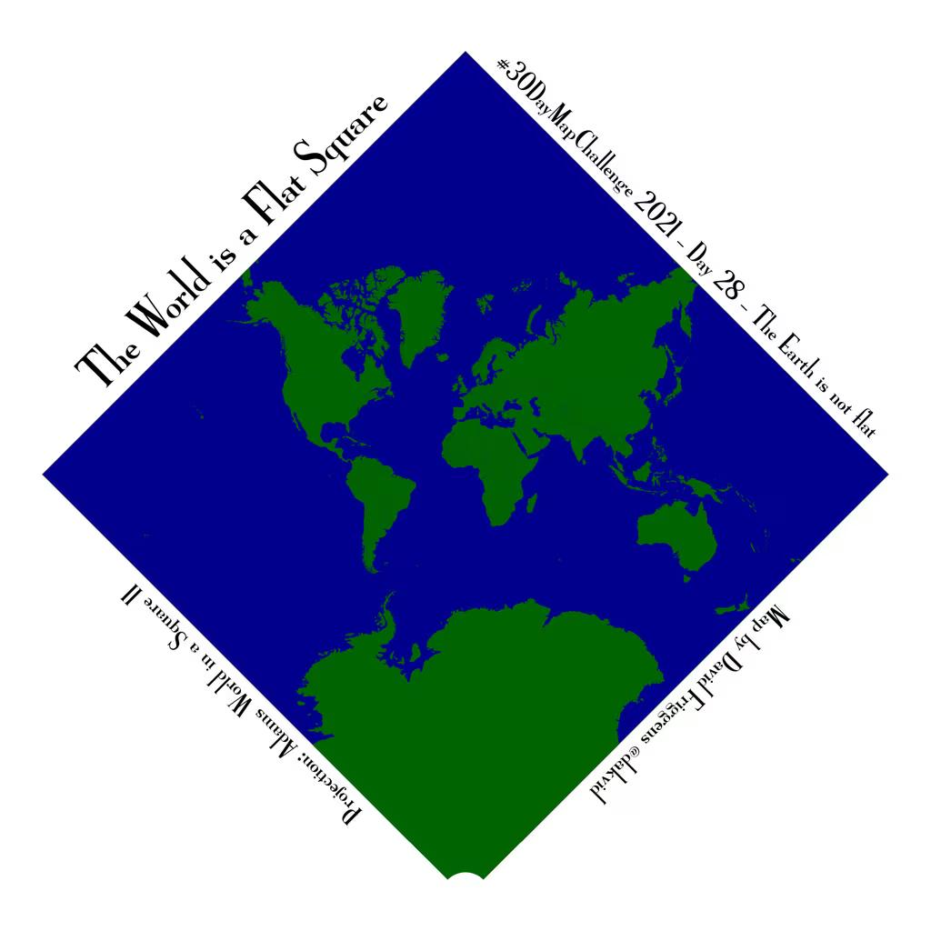
The Earth is not flat (Day 28) – Adams square II
A day to make a globe or play with projections. I went for the latter, as it’s an unusual one. This one didn’t take me too long, as I was able to employ skills I’d picked up through the month – easily changing projections, making the blue square, and adding angled text.
Data: Natural Earth
Tool: R
Learning: How much I’ve learned – I simply wouldn’t have been able to make this at the start of the month.
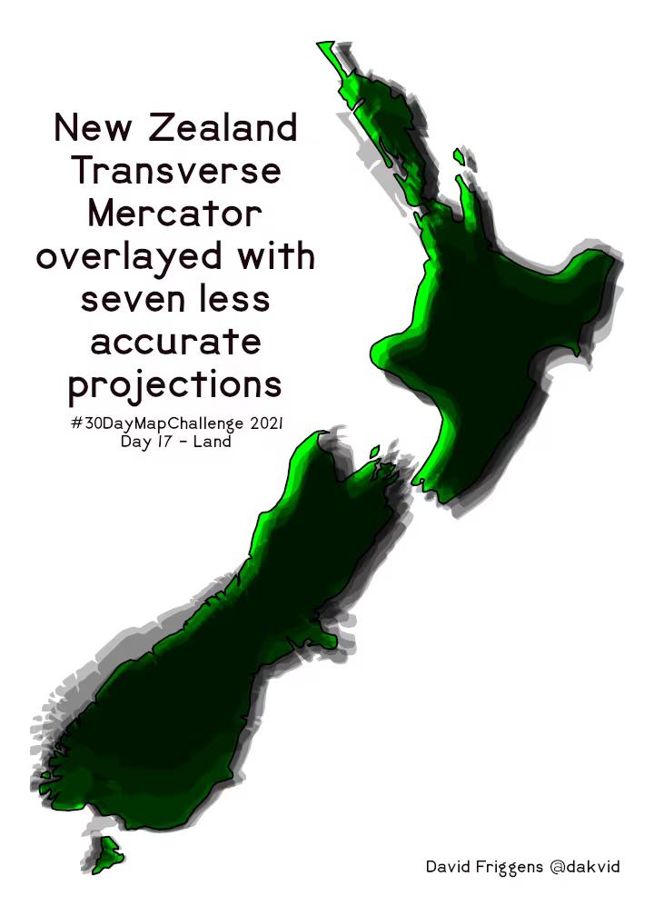
Land (Day 17) – New Zealand projections
As the previous theme says – the Earth is not flat. There are many different ways to project the Earth’s spherical surface onto a flat surface, with pros and cons in different circumstances. For maps of New Zealand only, the New Zealand Transverse Mercator projection (in green below) has the least distortion. If you see a New Zealand map that looks slightly odd, it’s probably because they used a “bad” projection. I decided to overlay some different projections to see how differently New Zealand was treated.
Tool: R
Learning: The exactness of the projection differences – I’ve never compared them directly like this before.
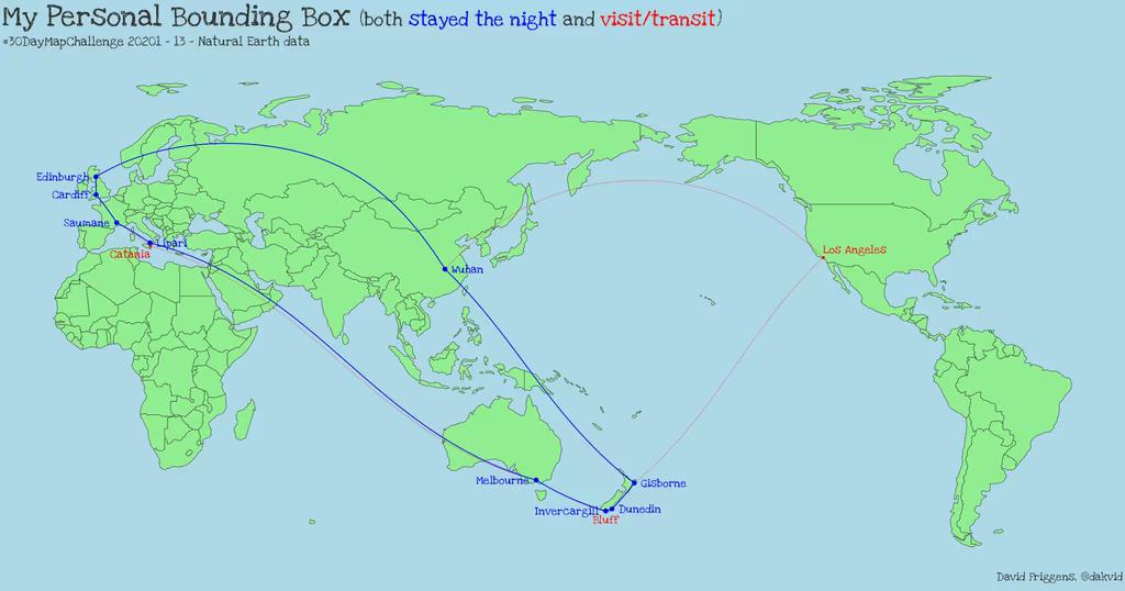
Natural Earth (Day 13) – Personal bounding box
There’s a lot for me still to explore in the Natural Earth data, but as an easy catch up I used their country borders to make a personal bounding box (or bounding polygon) of where I’ve travelled in the world.
Data: Natural Earth
Tool: R
Learning: Drawing lines between cities and guessing whether others would be on one side or another produced some surprises – especially when I switched from straight lines on the projections to the curved straight lines on a globe.
Heatmap (Day 27) – Earthquakes
I’ve never been a big fan of heatmaps and hadn’t made one before. This is a heatmap of magnitude 4+ earthquakes over the past 15 years. I’m not terribly excited by it (though the Stamen watercolour tiles are always nice), but not bothered to tweak it any further. I also realised later that I was adding earthquake magnitudes, which isn’t accurate because they’re logarithmic values.
Data: GeoNet
Tool: R
Learning: How to make a heatmap with {ggplot2}, though I’m unlikely to try this again any time soon.
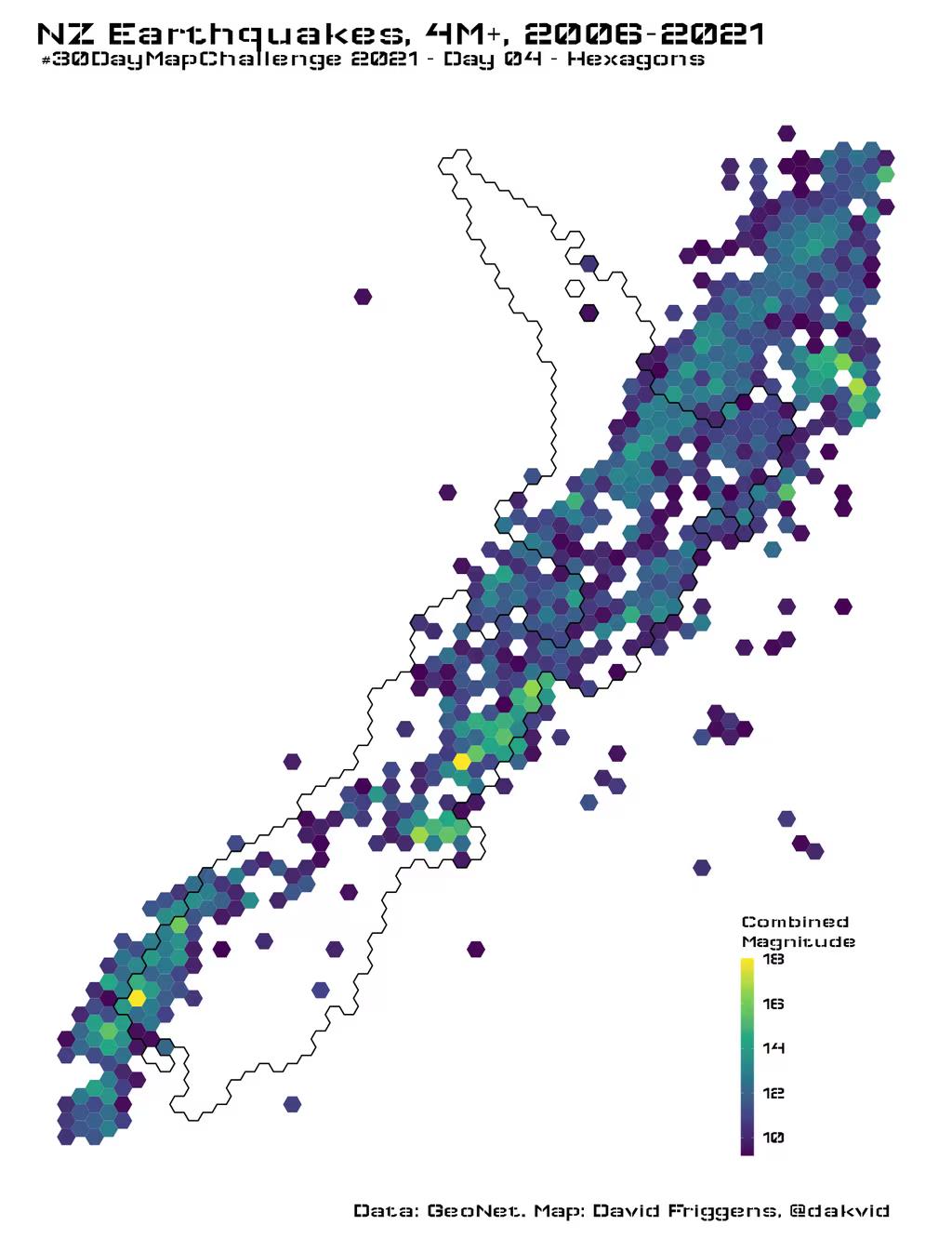
Hexagons (Day 04) – Earthquakes
After making the heatmap I discovered a relatively easy way to create hexagonal grids and thought it might work a bit better – and provide a catch up on Day 4. Initially this had the same logarithmic flaw as the first heatmap, but I revised it to be more accurate (and colourful!). A magnitude 7 earthquake is 10 times the size of a magnitude 6, which is 10 times the size of a magnitude 5 etc (that’s as accurate as I need to be for now. So 5+6+7 should be 7.05, not 18.
Data: GeoNet
Tool: R
Learning: Creating and working with hexagonal grids. Combining logarithmic values sensibly.
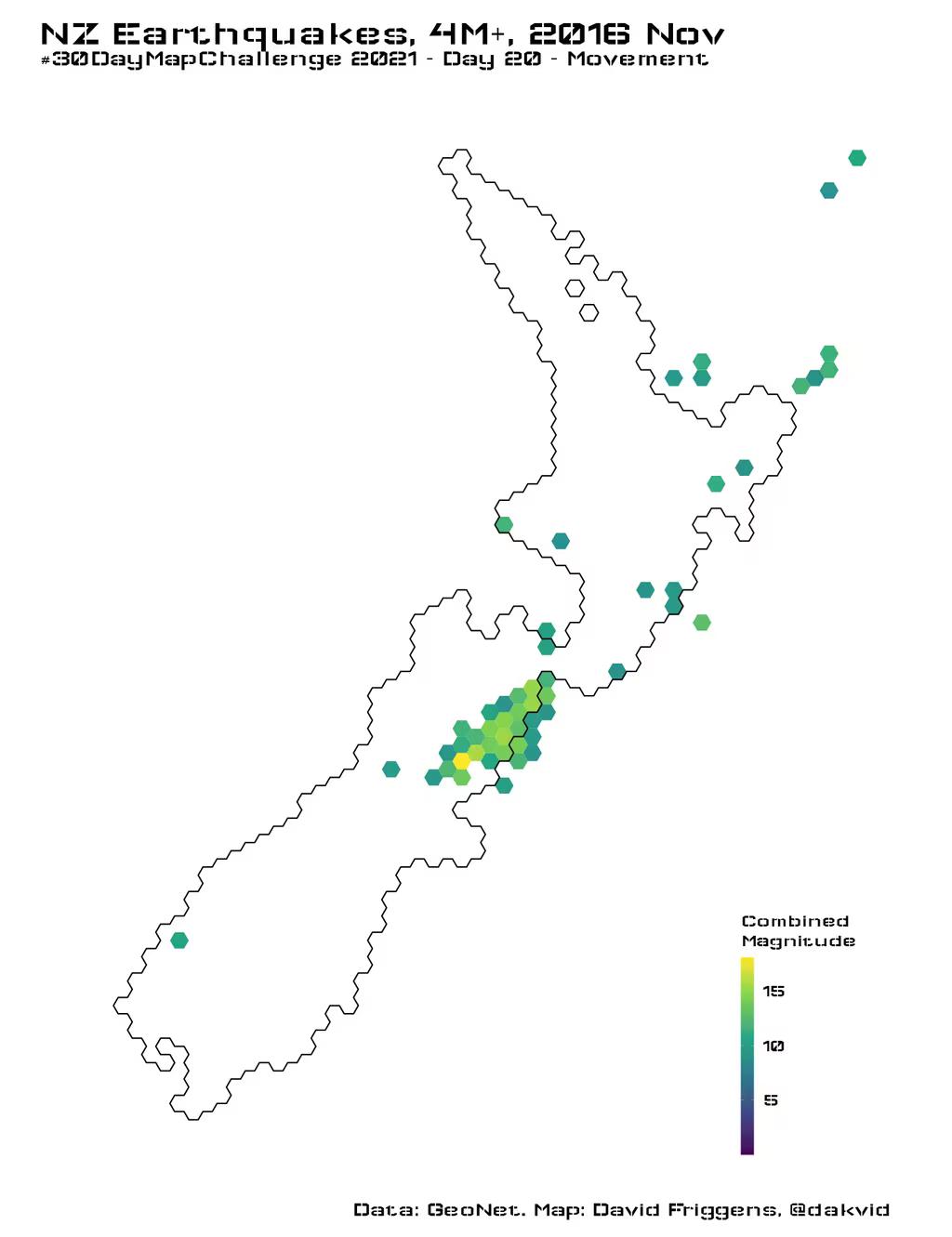
Movement (Day 20) – Earthquakes
Looking for a quick win at the end of the month, I split the above hexagonal heatmap by month to make an animation – click through to the tweet to see the video.
Data: GeoNet
Tool: R
Learning: Mostly I was combining existing skills, but I had to work out how to fix the colour scale to be the same range in every month.
Meta
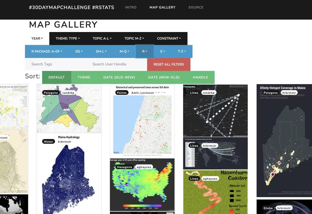
Metamapping (Day 30) – R gallery
The final theme was “metamapping”, with possible suggestions to do something with your maps, such as make a gallery or write a tutorial. I decided earlier in the month to make a gallery of other people’s maps. I’ve learned a lot from maps that other people have shared, but especially those from other R users who have made their code available. These aren’t always easy to find on Twitter, so I’ve started collating all of the maps from the challenge with R code that is available to be inspected and adapted.
It’s a work in progress – I’ve tried to focus more on making my own maps during the month – but there are already 300+ maps included. By the time I’m caught up over the next couple of weeks I expect it to have more than doubled.
Final Thoughts
The past month has been exhausting and challenging, but also incredibly fun. I have participated in the previous two challenges, but this year I was able to create – and learn – much more. The event has become an annual fixture, and I’m definitely looking forward to next year.